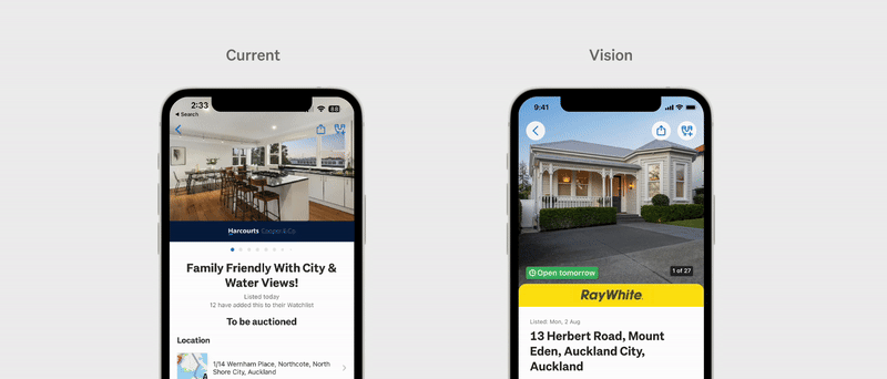
Property listing page uplift
A fresh look at Property listing details page.


My role
Team
Platform
iOS & Android apps
The problem
We were looking at doing a series of continuous improvements to the app property experience as part of the initiative to improve our first choice preference score. Doing a bunch of individual improvements without a clear end goal could lead to creating a disjointed experience, therefore we wanted a clear unified vision for the property LDPs to ensure we were all moving toward a desired destination.
The solution
We focused on the property listing detail page (LDP). I took the existing page and explored ways to give our LDPs a fresh look while maintaining a consistent experience by updating or using existing component within our design system.
In the end we made about 33 individual changes to the LDP.
Why did we want to do a bunch of continuous improvements?
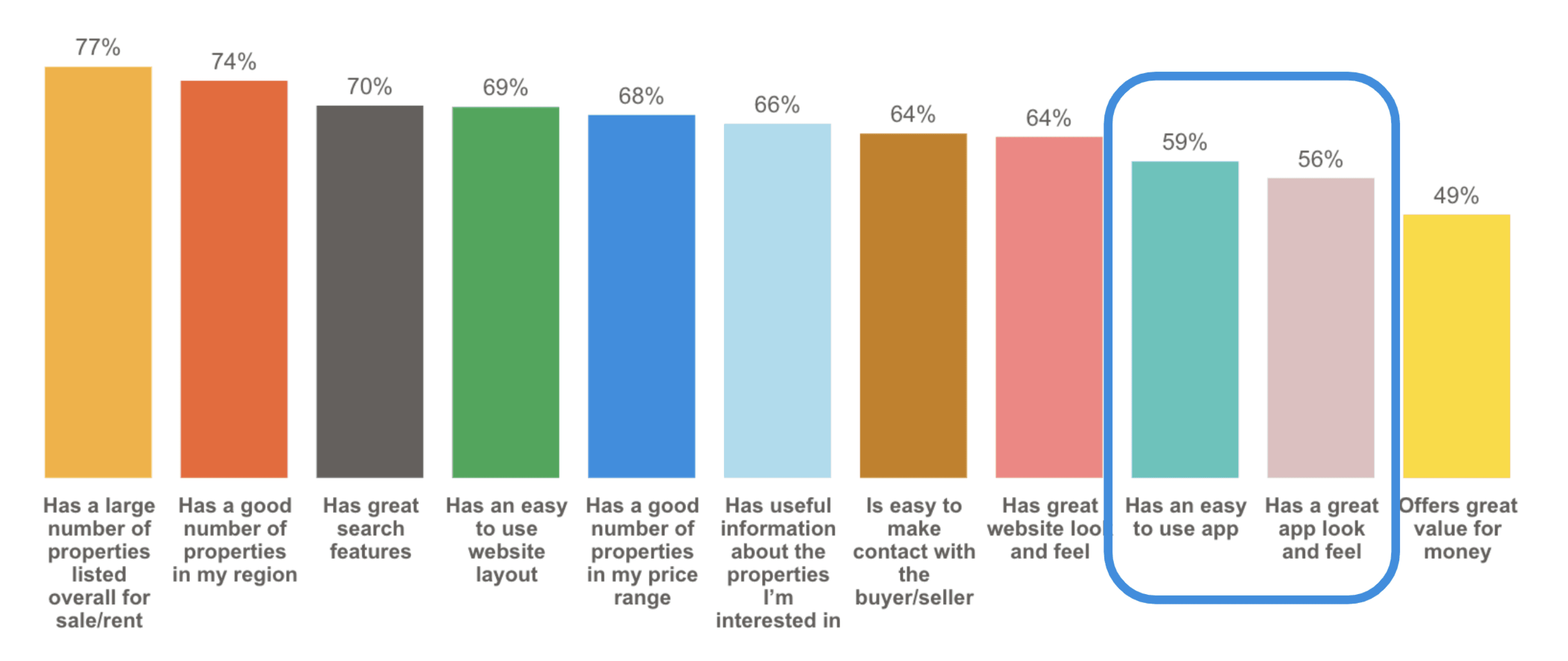
This work was designed to support one of the Property OKRs of improving the ‘First Choice preference score’, but is more directly targeting the "Has great app look and feel' driver statement. Although we are still leading in the market, we had seen a downward trend before this work. This data comes from a monthly Perspective survey sent out to understand what property seekers in New Zealand prefer when it comes to property portals and apps.
Therefore the data is based on the respondent's perception of Trade Me not based on actual activity on platforms. The great app look and feel is measured against other property portals in NZ that we believe are our direct competitors.
Why the LDP
In order to figure out what improvements we should be tackling, we did a general audit of the Trade Me property app experience against local and overseas property peers. This highlighted various areas for enhancement. Given our team's constraints and limited resources, we focused on addressing issues within the LDP because this area had the most opportunities and met our requirements.

So what’s what was designed?
About 33 proposed improvements of varying sizes were pitched to our stakeholders. The thinking behind each improvement is heavily based on competitor analysis and past research we’ve done.
Honing into what the user goal was for the LDP. We have defined it as “I want to see and understand the information about a property listing, so I can decide if it's of interest to me and if I wish to take the next steps”
Breaking down some of the ideas into value groups….
An enriched media experience
Seeing imagery and media is important to property seekers to get a feel of the property before viewing it in person. A picture speaks 1000 words, images are what users show to their friends and family. Therefore we must offer the best media experience we can.
Proposed ideas:
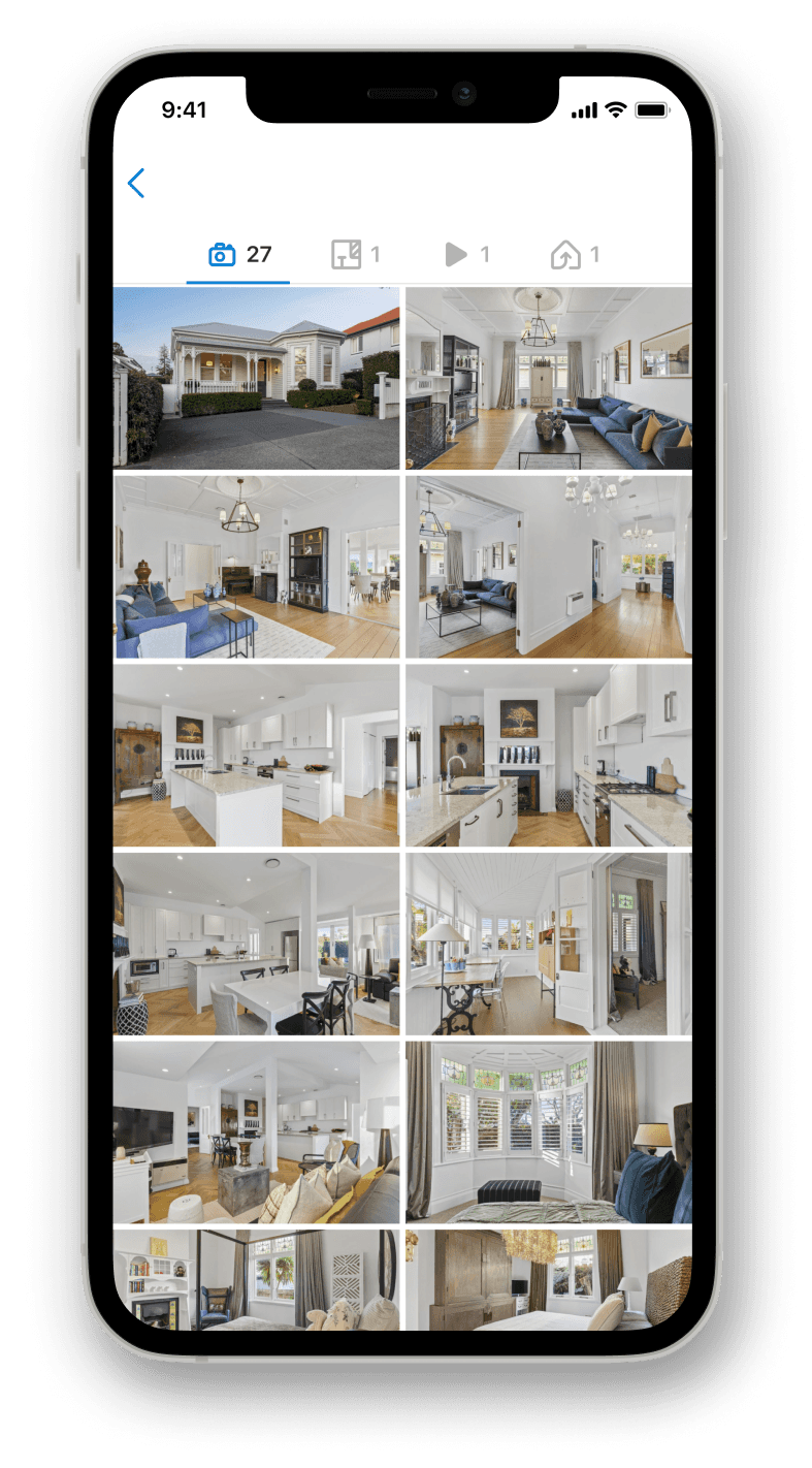
Add a grid view to the photo gallery. To reduce the friction for return users to find a specific photo so they don’t need to swipe 15 times to get to their desired photo.
Increase rich media prominence and discoverability with visual filters. Currently, rich media can be buried within the LDP, but we have data showing listings that has rich media has more listing engagement (email, watchlist & phone reveals).


Clear and engaging next steps.
For our sellers, a key success metric is getting their property sold, and to achieve this, it's crucial to see high engagement on their listing. Therefore, we aim to ensure there are clear next steps for users interested in a property.
Proposed ideas:
Making primary engagement buttons more prominent. Some of the primary engagement buttons are buried within the LDP. To ensure the user are able to find the action the want to take.
Uplift of the sticky agent contact buttons. Users don’t really get any information about the agent until they are at the bottom of the page. By adding the agent image and name with the contact button makes the interaction to more human.
Improve the clarity of adding open home to calendar. The current open home times UI is not obvious to users that they can add the open home time to their device calendars.
Table stakes
To be the best app in the market, we need to consider incorporating valuable features that our local competitors offer. By introducing new, competitive features, we can enhance our user experience and stay ahead in the industry.
Proposed ideas:
Improve our map component to include more interactive and informative information. Currently, the map component is just a map with the property highlighted. We can do so much more, like offer more locational data such as commute information and flood zone data.
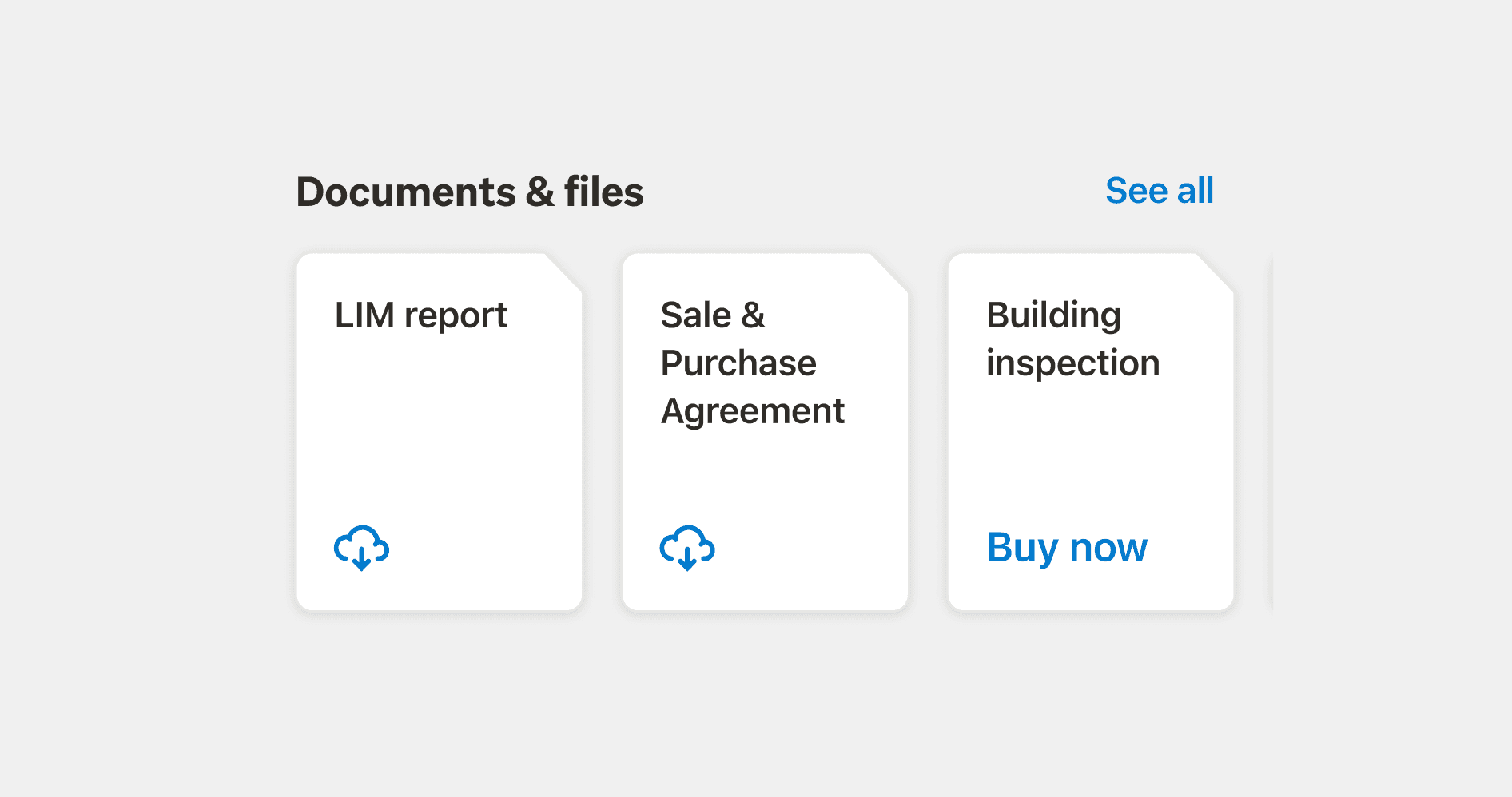
Introduce documents & resources. Giving users access to more information for the buyer so they can be as confident as they can be for their purchase and saving them time to request multiple agents across different listings for similar documents or resources.


User experience uplifts
A general uplift of the LDP to bring it to a more modern & slick era. Little change like has proven in the past to be very successful. Small step to big wins.
Proposed ideas:
Uplift the header UI for share, watchlist and back arrows to be more prominent. The icons sometimes can be hard to see sitting on top of the image.
Change pagination to an image counter. The dots don’t give the user a clear indication of how many photos the listing has.
Uplift the way we display property attributes. The current design makes the page feel dated, to give it a fresh look we want to create a more visual and digestible way to display the listing’s property attributes that can make it easier for a user to scan the information.
When designing the concepts for property, I kept the other business units in mind. To ensure decisions made can be easily translated across the business for a look and feel.

The results & next steps
The measures of success for this was quite a laggy metric as we had to was a couple of months to get the first choice preference survey results. We did see a 2pt increase but we are unsure if the improvement was due to our changes or other external factors. If we could go back, I would change how we identified success, and find more stable & direct data to ease against.
Besides the first choice preference score we did see other other uplifts in some of our base line engagement metrics. 6-8% increase in watchlist adds and 2-3% increase in enquires. This is significant as our engagement metric are important to our seller to gauge market considerations.
This initiative helped kick start and drive excitement to improve the look and feel across our apps, starting with a refresh project to the property landing page.
© 2024 Design by Florence Lo with Framer