Map search in the apps
Introducing map search to our larger property audience.

My role
Team
Designer, Product Manager, Product Owner, 4 developers, 1 testers
Platform
iOS & Android apps
The user problems
We were considering retiring our property app, but before doing so, we need to incorporate some valuable features from our property app into our main Trade Me app. One of the key features to bring over is map search. Map search is essential for our users, enabling them to find their desired locations more efficiently and browse across multiple districts—an improvement over the limitations of our list view search.
The solution
The aim was to get parity with our property app, but I designed the experience with some improvements to provide clarity and future proof the design. As part of the go to market plan, we experimented ways to inform the user of the new feature. future-proof
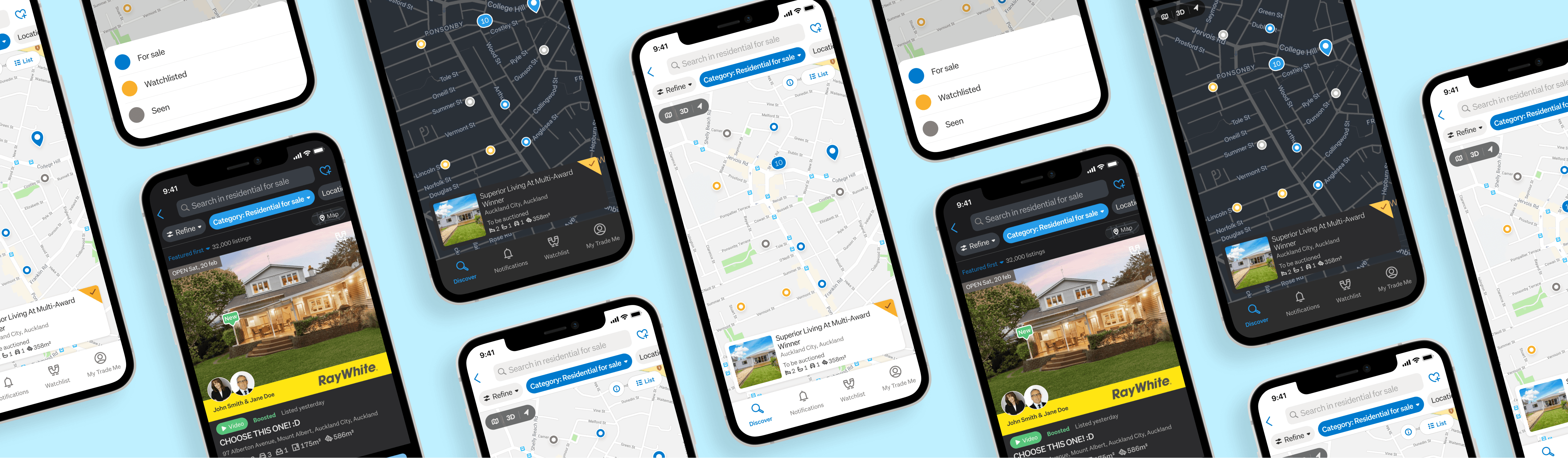
The map search offered the expected behaviours similar to the property app, such as the ability to move around and interact with the map view. Pins on the map corresponded and link to listings on site. Along with these features, there are 3 new improvements introduced.
Differentiation of pins
Instead of just one color of pin, we included three new types of pins. This allows users to easily see, at a glance, which properties they’ve viewed and which ones they have added to their Watchlist.


Load more listings
Users can see how many pins are showing of the total amount of listings available within their search. Our listing api only loads 50 results at a time due to how our pages load in the list view. We want to allow the user to be able to see all the available listing in an area, to ensure they are not missing out on any potential properties.
Map listing cards
We designed it with future scalability in mind, allowing us to easily add depth products that bring more value to our agents. This approach ensures that we can continuously enhance our offerings and provide innovative tools to help our agents succeed.

Go to market
Although map search is a well-known and existing feature within our property app, it is new to users on our main Trade Me app. Therefore, we needed a way to inform our users about this new feature. We explored several methods to help users discover map search, but due to scope and timing constraints, we opted to experiment with quick and lightweight solutions.

The red dot experiment
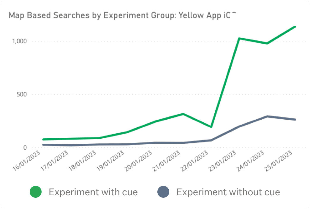
We experimented with an animated red dot next to the map entry point icon. This subtle cue encourages users to discover the feature naturally without being intrusive. This experiment tested if micro-interactions can effectively drive feature discovery and could be applied to future feature discovery projects. We conducted an A/B test, rolling out to 50% of iOS users—half with the red dot and half without.
The impact: The red dot variant had over 100% more (double) map searches compared to "no cue", meaning the animated red dot definitely has made a difference with how much engagement there has been but it was far off from hitting our target goal of 10% of residential property searches on the app are using map based search. Therefore we experimented with a different approach.

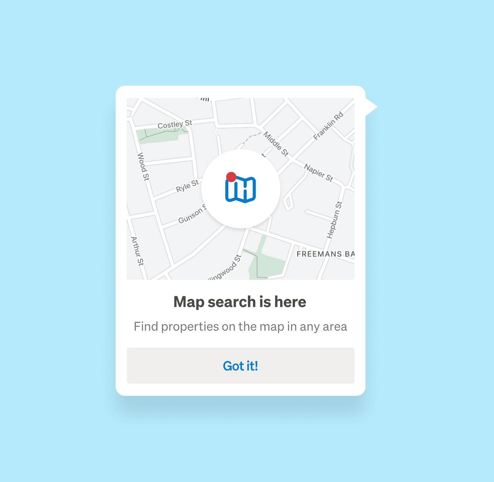

Modal prompt
We needed to increase user awareness of the map feature, so we opted to implement a prompt that was less subtle compare to the red dot. This prompt grabs users' attention during property searches and informs them about the feature.
The impact: The new prompt did well. It’s performing over 200% more than ‘no cue’ and over 60% more than the red dot variant. Despite this improvement, we still did not meet our ambitious target of 10% of residential property searches using the map-based search. Upon reflection, we may have set our target slightly too high, as it was based on our property app's map engagement, which has had years to build its audience. Additionally, many highly engaged property users still prefer the property app over the main app. Nevertheless, we are optimistic that the new prompt and the user migration efforts will lead to a gradual increase in map usage.
The overall results
Despite the low usage, our key metrics indicate that users who use the map-based search are significantly more engaged. While it's unclear from the data whether "users use maps because they’re more engaged" or "users are more engaged because they use maps," anecdotal evidence from user interviews suggests that they find the map search valuable, especially when searching for a flat without a specific location in mind.
This map implementation significantly out performs in our web map experience even though the web experience has been available to user for years. Web has just over 1% (5000’s searches) & apps 6.2% 15,000 searches.
© 2024 Design by Florence Lo with Framer